New site design (July 2012)
_geek stuff*_*
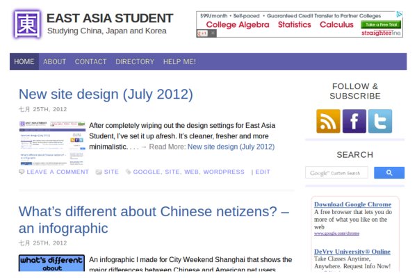
After I completely wiped out the design settings for East Asia Student, a friend pointed out that this could be an opportunity to do a better job of designing the site’s presentation. With that in mind, I’ve set it up as you now see. It’s a lot cleaner, fresher and more minimalistic.

The new design also loads a lot faster, as it’s almost entirely HTML and CSS. The theme itself only loads two images per page, and the rest is loaded in asynchronously with JavaScript. So you get the main content of the page almost immediately (server permitting), and the extra fluff like adverts and the search box get loaded in whilst you start reading.
One result of that is that I’ve got the Google Page Speed score for the site up from 84 to 97, which is very satisfying. That’s partly due to reducing the use of images in general, and using CSS sprites for the subscribe buttons to the right. Your browser downloads one image for all three and their highlighted versions, then cuts it up based on CSS. That saves time with requests and the total size of the download:

Another change is that I’ve set up Google Custom Search for the site rather using the default WordPress search function. The results are much more useful, plus it handles things like hanzi and pinyin properly. It also means I can get a little bit of money from advertising in the search results. Speaking of which, the new theme has seen a small but consistent increase in advertising revenue in the few days since it went up.
So, every cloud has a silver lining, or to be more topical: 塞翁失馬.
